A combination logo is a powerful tool for brand identity. It blends text and symbols to create a memorable, recognizable visual. But what exactly does the combination logo definition mean? Let’s break it down.
This type of logo combines a graphic and a wordmark. It offers flexibility in representing your brand. A combination logo can better convey your business’s personality and message. It does this by merging the two elements. Curious how this design style works? Keep reading to learn why it is so effective and how it can benefit your brand.
What is a Combination Logo?
When you hear the term combination logo, you might wonder what it means. Let me explain it simply: a combination logo is a design that blends both text and graphics into one. It’s a common style you’ll see in some of the most iconic logos, like Apple, Nike, and Amazon.
What Makes a Combination Logo Special?
Combination logos combine the greatest features of both designs. It uses a graphic element to catch your attention and text to clearly state the brand name. This combination helps create a strong, memorable identity.
From a design perspective, there are two types of combination logos: loose designs and tight designs. Each has unique advantages and challenges.
Loose Combination Logos
These designs pair a logomark (the graphic part) and text, but they’re not tightly connected. You can easily separate them. Think of logos like Dropbox they’re simple and functional.
Pros of Loose Designs
- Highly flexible: You can use the graphic or text independently.
- Easy to design and apply to different materials.
- Clean and straightforward appeal.
Cons of Loose Designs
- Sometimes it feels less original or exciting.
- Might lack a strong “wow” factor.
Tight Combination Logos
In tight designs, the text and graphics are merged into one unified look. You can’t easily pull them apart. A great example is the Burger King logo, where the text and icon work seamlessly together.
Pros of Tight Designs
- Visually unique and original.
- Stands out immediately.
Cons of Tight Designs
- Harder to design and create effectively.
- Less flexible: You need to use the full logo everywhere, which can be tricky in small spaces.
Key Features of Combination Logos
A combination logo is more than a design it’s a branding powerhouse. It combines symbols and text to create a unique identity. It should resonate across platforms. But what makes these logos so effective? Let’s analyze their key features. Clarity, balance, and recognition are vital to their success.
Symbol and Text Synergy
- Combines imagery (like icons or illustrations) with typography for a cohesive look.
- Provides clarity by ensuring that the symbol and text work together without overwhelming the design.
- Balances visual and textual elements, making it versatile for any business style.
Versatility
- Works seamlessly on everything from small business cards to massive billboards.
- Confirm scalability, so the logo retains its clarity whether it is enlarged or shrunk.
- Adapts well to digital and print formats, offering consistent brand representation everywhere.
Memorability
- The text confirms recognition by providing the brand name directly within the design.
- Imagery adds distinctiveness, helping viewers associate the logo with the brand.
- Together, these elements strengthen visual recall, ensuring your brand stays top of mind.
Timeless Appeal
- Combines modern aesthetics with simplicity for a logo that lasts through trends.
- Focuses on balance, ensuring that no single element feels outdated or out of place over time.
- Prioritizes distinctiveness to maintain relevance in competitive markets.
Clarity and Balance
- Keeps the design simple yet impactful to avoid confusion or visual clutter.
- Balances typography and imagery so that each element complements the other.
- Promotes recognition with a clear and clean layout that audiences find easy to identify.
Distinctiveness
- Stands out by creating a unique combination of symbols and text.
- Reflects the brand’s personality, making it easy for customers to connect emotionally.
- Delivers recognition even in crowded industries, ensuring the logo remains unforgettable.
Scalability
- Maintains clarity and detail, no matter the size.
- Designed with flexibility in mind, ensuring that it works on both large and small platforms.
- Balances all elements to avoid distortion when resized.
Combination logos provide brands with clarity, balance, and recognition. These qualities are important for standing out in today’s competitive market.
Importance of Combination Logos in Branding
Combination logos are a smart choice for creating a strong brand identity. They bring text and symbols together, making them effective and versatile. This design works for any business, big or small, by combining creativity and function. Let me show you why branding with combination logos can make a difference.
Why Businesses Choose Combination Logos
I see many businesses pick these logos because they deliver results.
- Boosts Recognition: Symbols grab attention when the text makes the name unforgettable.
- Increased Flexibility: These logos work on social media, websites, and product packaging.
- Improves Brand Personality: Symbols add creativity while text adds professionalism. This creates a well-rounded image.
- Boosts Marketing: A combination logo ties your brand message together. It makes your marketing more effective.
How Combination Logos Help Branding
For me, the best part about combination logos is how they communicate the brand’s message.
- Strengthens Brand Message: The text and symbols explain the business in seconds.
- Encourages Consistency Across Platforms: You can use the symbol alone or include the full design. Either way, people recognize your brand.
- Improves Logo Visibility: Whether on a billboard or a mobile app, the logo stands out clearly.
What Statistics Say About These Logos
Numbers don’t lie. I’ve seen studies showing that logos with text and symbols have a higher recall rate. In fact, brand recall can jump up to 78% with this style. That’s because the design is easy to understand and remember. Businesses using combination logos often notice improved loyalty and customer trust.
Components of a Combination Logo
A combination logo merges two elements: text and imagery. It creates a memorable design. Each part plays a role in making the logo clear, versatile, and impactful. I’ll explain it to you step by step.
Text Element
The text, or typography, is more than words. It represents your brand’s voice.
- Logo Text Elements: Pick the right font that matters. It can make your logo feel bold, elegant, or approachable.
- Tagline (Optional): Adding a short phrase can elevate your message, but keep it simple and easy to read.
Symbol/Icon
This part grabs attention and tells a story without words.
- Icon or Symbol: Shapes, icons, or illustrations communicate emotions and values instantly.
- Logo Symbols: Think of Nike’s swoosh or Starbucks’ mermaid. These visuals are powerful and easy to recall.
Color Scheme
Colors bring the logo to life. They reflect your brand’s personality and make it stand out. A bold color scheme can attract attention when softer tones create a sense of calm.
Versatility
Combination logos adapt to any platform. Whether it is a website, social media, or product label, the design remains clear and effective.
Advantages of Combination Logos
A combination logo is a smart choice for businesses. It blends text and symbols to create a design that is both functional and memorable. I’ll explain why it works so well.
Versatility Across Platforms
I’ve found that combination logos adapt effortlessly. It works for a website, business card, or billboard. The design stays sharp and professional. This versatility makes it a great option for consistent branding.
Clear and Memorable Branding
A combination logo benefits your brand by combining visuals and text. The symbol grabs attention when the text confirms people remember your name. Together, they make your branding unforgettable.
Increased Brand Recognition
With the right design, your logo builds strong recognition. The icon and text can even be used separately. This flexibility lets you adjust the logo for any space or platform. It will keep your brand identity intact.
Professional and Modern Appeal
A combination logo communicates professionalism. The balanced mix of elements gives your business a modern and polished look. It leaves a great first impression and strengthens your connection with customers.
Clear Communication
I’ve noticed how these logos make messages clear. The symbol conveys emotion. The text confirms that your audience knows your brand at a glance.
Scalability
Combination logos scale beautifully. They look great on anything, from small product tags to large banners. You lose no detail, and your brand remains recognizable.
Challenges in Designing Combination Logos
Designing a combination logo can be tricky. It’s not about creating something that looks good; it needs to work well for the brand and the audience. Let me explain the main challenges and how they affect the process.
Balancing Simplicity and Uniqueness
One of the toughest logo design challenges is finding the right balance. A logo should be easy to recognize quickly, yet distinctive enough to make it stand out from others. Too many details can clutter it. Too few can make it forgettable.
Ensuring Scalability
I’ve noticed how important logo scalability is. A good design works on everything, from tiny icons to huge banners. If the details are too fine or the text too small, the logo can lose its impact on smaller platforms.
Maintaining Versatility
Versatility plays a big role in logo design. The combination of text and symbols should adapt to different mediums. The logo must be the same and visually appealing, whether on a shirt or a website.
Achieving Visual Harmony
Balancing the text and icon is another challenge. Both elements need to complement each other, not compete. A well-designed logo aligns these parts to create visual harmony and clear communication.
Navigating Client Expectations
Every client has different ideas about what their logo should represent. As a designer, it is important to balance meeting customer expectations with staying true to the brand’s identity. This requires careful listening and creative problem-solving.
How to Design a Great Combination Logo
Designing a combination logo might seem hard at first. But, it’s easier than you think. With the right steps, you can design something professional and memorable. This is the way I handle it.
Research Your Audience
Start by understanding who your logo is for. Knowing your target demographic helps you design something that speaks to them. A playful design works for kids’ brands when a sleek look suits tech or luxury businesses.
Pick the Right Font
Fonts matter more than you think. Choose one that aligns with your brand’s personality. A bold font makes a statement when a script font feels elegant and personal.
Add an Icon or Symbol
The icon or symbol is the heart of a combination logo. It gives your design a visual identity. Could you keep it simple but meaningful? An effective icon should connect with your brand’s values and audience.
Choose Colors That Pop
Colors grab attention. Pick shades that represent your brand’s vibe. Bright colors create energy when neutral tones feel calm and professional. Balance your palette for a polished look.
Focus on Harmony
Text and visuals need to complement each other. Balance text size and placement with the icon for a unified design. This harmony Confirms your logo feels cohesive and professional.
Test Scalability
Your logo needs to work everywhere. Test it on different devices, like smartphones and desktops. Make sure it looks great in both small and large sizes.
Designing a combination logo doesn’t have to be hard. Follow these logo design tips, and you’ll create something that’s balanced, recognizable, and perfect for your brand. Whether you’re into DIY logo creation or working with a designer, these steps will keep you on track.
Comparison with Other Logo Types
Every logotype has its unique style. Picking the right option feels tough at first. Knowing their differences makes it easier to decide. I’ll explain it in a way that is easy to understand.
1. Wordmark Logos
Wordmark logos use typography to uniquely highlight your brand name.
Advantages:
- Provides a clean and professional look.
- Makes your brand easy to recognize and remember.
- Ideal for businesses with unique or catchy names, such as Google or Coca-Cola.
Comparison:
Wordmark logos focus solely on text, unlike symbol logos. This type works best for businesses that focus on their names over visuals.
2. Symbol Logos
A symbol logo relies on a graphic or icon to represent your brand, like Apple’s iconic apple.
Advantages:
- Delivers a simple yet powerful message.
- Adapts well across various platforms and sizes.
- Sticks in people’s minds after recognition.
Comparison:
These logos stand apart from wordmarks and combination types by excluding text. They work exceptionally well for brands with strong visual identities or global audiences.
3. Combination Logos
Combination logos pair text with a symbol or icon to create a balanced design.
Advantages:
- Offers versatility and customization options.
- Builds strong brand recognition with added flexibility.
- Serves as a great choice for new businesses aiming to establish an identity.
Comparison:
This type is better than standalone text or icon logos. It perfectly blends visual and verbal branding. It is especially effective for companies needing adaptable marketing materials.
4. Abstract Logos
Geometric shapes and unique designs define abstract logos, conveying brand concepts creatively.
Advantages:
- Grabs attention with its originality.
- Creates a modern and distinct aesthetic.
- Ideal for businesses aiming to showcase innovation or forward-thinking ideas.
Comparison:
Abstract logos focus on artistic expression, unlike traditional types. They suit brands seeking a unique, imaginative design.
5. Mascot Logos
A mascot logo uses a character or illustration to represent the brand.
Advantages:
- Brings personality and relatability to your brand.
- Works well for family-friendly or entertainment-focused industries.
- Builds emotional connections with audiences.
Comparison:
This type adds a playful touch. It sets it apart from minimalist designs that focus on sleekness.
6. Emblem Logos
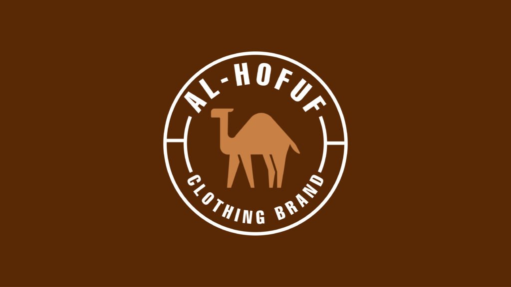
An emblem combines text within a symbol or badge, delivering a timeless and classic appearance.
Advantages:
- Exudes tradition and authority.
- Works perfectly for schools, organizations, and luxury brands.
- Instills trust and heritage in the audience.
Comparison:
Unlike modern designs, emblems focus on legacy and prestige. So, institutions and upscale businesses prefer them.
Famous Examples of Combination Logos
Combination logos are all around us, used by some of the most recognizable brands. Let’s look at a few standout examples and why their designs work so well.
1. Burger King
Burger King’s logo is a fantastic example of a combination logo. The brand blends a bold, modern typeface with a simple graphic of a burger. This clever design reinforces its identity when maintaining simplicity.
2. Lacoste
The iconic crocodile paired with the brand name is a perfect example. The imagery adds a visual hook when the text Confirms brand recognition, especially in global markets.
3. Doritos
Doritos’ logo merges the triangular chip shape with bold, vibrant lettering. This combination captures the product’s fun and edgy personality, making it memorable.
4. Adidas (Trefoil Logo)
Adidas uses its name alongside its trefoil symbol in one of its versions. This combination represents heritage while keeping the brand’s identity unmistakable.
5. Pepsi
Pepsi’s logo includes its name paired with its iconic globe symbol. The combination reflects trust, legacy, and innovation, all in one design.
6. Adobe
Adobe’s logo has a stylish “A” paired with its name. The design feels creative and professional.
7. Amazon
Amazon’s logo combines its name with a subtle smile represented by an arrow. This arrow connects “A” to “Z,” symbolizing the wide range of products available.
8. Nike (Early Version)
While Nike often uses the swoosh alone now, early versions featured the word “Nike” alongside the swoosh. This combination laid the foundation for its strong brand identity.
9. MasterCard
The MasterCard logo combines overlapping circles with its name. This design signifies connection and trust, making it highly relatable to its customers.
10. Subway
Subway’s logo uses bold typography with arrows on the “S” and “Y,” symbolizing freshness and movement. It is a great combination of visual meaning and textual clarity.
Conclusion,
The combination logo definition highlights the blend of text and symbols for a powerful brand identity. This design style confirms clarity and recognition across all platforms. It effectively communicates your brand message and leaves a lasting impression.
Both small businesses and established brands can benefit from this versatile option. A combination logo balances style and function perfectly. Start designing your logo now to connect with your audience and stand out in the market.
What is a combination logo, and why is it effective?
A combination logo combines both text and a symbol or icon. This makes it powerful because it helps people remember your brand. The text shows the name, and the symbol adds meaning. Together, they create a strong, recognizable identity.
Can a combination logo include more than one symbol?
A combination logo can include more than one symbol. But it’s important to keep it simple. Too many symbols can make the logo confusing, so each one should support your brand message.
What industries benefit most from combination logos?
Combination logos work well in many industries, like retail, tech, and food. They are great for businesses that want to build their brand, like Nike or McDonald’s.
How do I test my combination logo’s effectiveness?
To test your combination logo, get feedback from your audience. Ask if they can easily recognize the logo and remember the brand. Test it on different devices and in different sizes to make certain it looks good everywhere.
What tools are best for creating combination logos?
Some great tools for creating combination logos include Adobe Illustrator, Canva, and LogoMaker. These tools are easy to use and help you mix text and images to make a professional logo.